12 Significant Guidelines for E-Commerce Homepage Design
Effective e-commerce homepage design relies heavily on visual hierarchy (and, for that matter, all web design).
Most of the sectors in the world has been upgraded through online gradually – shopping which includes in it as well. Because of this, the e-commerce sector has always been primarily engaged between buyers and sellers. You can sell anything on online that maybe sneakers, gadgets, clothing, home decors or anything – you need to be ready to attract customers to make them purchases from your store.
In an e-commerce site, the homepage and its design play a prominent role in grasping the attention of customers. It’s a huge pathway for more users to kick their e-commerce journey from the homepage of your e-commerce site. Therefore, it is more significant to set up the right elements and designs, to capture the focus of users on an e-commerce site.
Visual hierarchy plays a huge role in designing the successful homepage of the e-commerce site. The stable visual hierarchy enables you to convey the brand message to more customers rapidly. CTA (Call to Action) design helps the customer to navigate to next step, beyond the homepage and towards the product listing, product information, order placing and other essential pages. This article will discuss the 12 significant guidelines to make the best homepage with successful designs in your e-commerce store.
Table of Contents
Focusing on Objective to Prioritize the Element for E-Commerce Homepage Design
Decide the priority of elements on the homepage as per the objective. To design the homepage, some important things need to be decided, are listed below:
- Which section you want users to click on after the homepage?
- What are all the information read by users instantly?
- Which pricing plan do you want to choose?
To set the visual hierarchy perfectly, you need to understand the priorities of element. In visual hierarchy, the main objective is to stick out important elements and less essential elements should be given less preference.
Some elements like CTA, value proposition, etc, are more significant than other elements or sections. Try to give more attention on these elements to grasp the customers.
Read More: Benefits of Outsourcing Software Development
12 Significant Guidelines to Enhance Your E-Commerce Homepage Design
-
Prevent Unnecessary Designs That Overload the Page
The users evaluating the website as attractive one or not, within 0.02 – 0.05 of a second, according to the study by google. Moreover, the website which is visually more complex are estimated as an unattractive on contrary to its simple counterpart.
Nevertheless, the prototypical sites are considered as good-looking sites, because they have simpler designs and are more relevant to the actual site. In short, look at the simple designs for an effective outcome. So, apply the same design on the homepage design of your e-commerce site, to make it look elegant.
Sometimes the complex sites are more grasping rather than simple sites because it does not extend to the user’s brains or eyes, hands to interpret, store and operate the information. If you want transmit information to the user’s brain, you’ve to input some more attractive colours or variations to be beautiful in the eyes of the users. So, it’s prominent to hold the consistency of every element in its colour programme.
-
Abide in the Visual Hierarchy Structure in Designing
The size and location of the content ought to be according to its relative value. The content which is larger in size and placed on top location catches more attention of the users. It’s a basic ethic in the visual hierarchy and follows the same in designing your homepage.
The top of the homepage is the visible and valuable part, as of the user will see it without scrolling the page. The valuable elements like logo, CTA, navigation, menu, selling point, and more, need to be placed here without fail. The elements which get less attention should be laid down in a comparatively smaller size, so the user can see it while scrolling the page.
-
Pay more attention to Transactional menu than Content Menu
Assume yourself as a customer, for a second. Then, think of yourself that, which section you prefer most, either FAQs (content menu) or the list of products on the site (transactional menu). Of course, most of us prefer transactional menu rather than content menu, they get a higher place in the visual hierarchy. Here, some tips are enumerated to decide the ideal place of a transactional menu:
- Mostly, transactional menu is placed on the front and centre of the homepage but sometimes found as a vertical menu down the left side of the page.
- Always place the transactional menu in larger size than the content menu.
- Make the transactional menu in a coloured banner either contrast to the background or design a border around the menu.
-
Place Value Proposition “Above the Fold”
“Above the fold” is a segment of the homepage where the users can see it without scrolling the page. This term arises from the newspaper because all the main headings are placed at the top of the first half page which are able to folded.
As like, you need to determine the priority of the content, while designing the homepage for your e-commerce store. So, make the important designs and elements to be served at first, then to the rest of the information. Value proposition is a centre element of the homepage. It visualizes the aim of the site and the company’s uniqueness.
-
Make Good Visual of Navigation Menu
Navigation menu contributes the most on the homepage of the e-commerce site. Many users are well-known about what they want to purchase like if they want t-shirts, they will go to clothing section and then to sub-categories for t-shirts section. Most of the web designers are examining whether to make the navigation menu a hidden one or partially visible one. The use of a hidden navigational menu was found to be a barrier to detecting the UX and content.
If you want users to visit the website and take any specific steps (landing pages), the navigation menu needs to be vividly on the homepage.
-
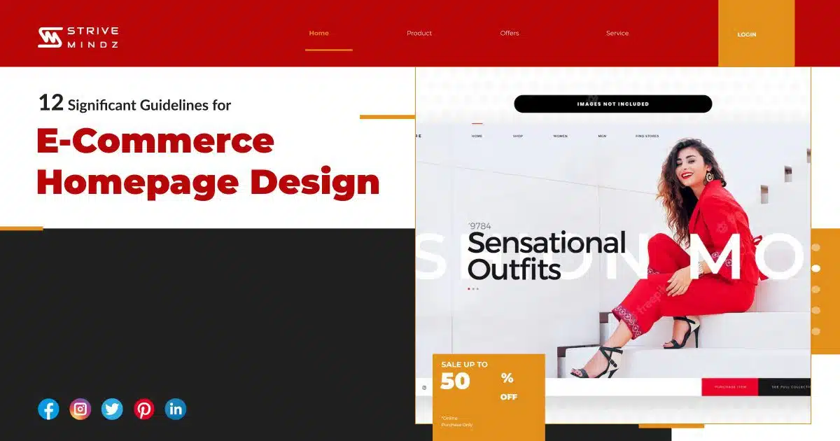
Show off The Pictures or Thumbnails of Essential Products
Mostly, our eyes are tending to be attracted by pictures than long text. Because it’s simple for an eye to gather the information from images than text. As well, pictures on websites gets 94% views than the text. In the e-commerce store, images are the only base element, that users look with 100% of concentration.
Pictures are more natural and rapid than text. Showing off thumbnails adjoint with product types will enhance the searches and distribute a better user experience. Make this guideline to improve your e-commerce site with more viewership.
-
Distinguish the Content Blocks using white Space
Make the content in a separate block, so that user can easily look into the content and they able to split it, like which is important and which’s not, according to their preferences. The content should be short and crisp on the e-commerce page. There are many ways available to distinguish and to provide the content “neat”.
White space is an unnoticed segment of the site like margins, grids, gutters, etc and often considered as a negative space. You can use enough white space, to make the content vivid and separate, thus evades the risk of diversion and misperception.
Use lines, grids and borders to distinguish the content blocks without meddling it.
-
Avoid Placing Promotions Above Product Categories
This guideline is more like above stated, which is used to eliminate the confusions in distinguishing the page elements. Users mostly baffling and considering the advertisement site as a part of the product list, while mentioning it above the product category.
As an example of mentioning the promotion like “Choose shirts 30% off” above the product list of all shirts, users will definitely consider that whole shirts placed below is on sale. Displaying the site is really depends on designing and aligning the elements. If the promotion site can be perfectly distinguished from product list, you can display it above the product list.
-
Make CTA clearly Visible
One of the major elements in homepage hierarchy is CTA (Call To Action), so display it clearly either by applying contrasted colour or leave lots of white space around it. Users often click CTA, design it in a remarkable way so that, it’ll never be missed out. Here, some ideas to make CTA clearly visible one:
- Always design the CTA in a bigger size and place it above the fold.
- Make the CTA surrounded with white space and change colour against the background.
Eliminate competing graphics that consumes more space, diverting fonts and colours, movable images, other CTA with high contrast colours.
-
Use CTA to get More Attention Than Links
Always CTA button gets more attention than hyperlinks. Actually, the CTA buttons are designed to be pressed. CTA is a significant one on your homepage, so, make it as in a button format, that would be great to view. Specifically, when no visible buttons on the home page.
-
Give Less Importance to Secondary CTA
The work of CTA is to drive attention on the most cherished action of the page. The users will get distracted from an essential element, if more CTAs are employed on the homepage. It’s the duty of users to find the differences between the CTA.
To eliminate this of confusion, you need to make the important elements clearly noticeable. You can employ the secondary CTA, but give it a second preference in the visual hierarchy.
-
Use Visual Cues to Focus CTA
Visual cues play a huge role in drawing attention to the CTA. According to research, a hand-drawn arrow employed in homepage, pays more attention to the CTA. Alternatively, you can draw a line to point towards the CTA. Some other visual cues to point CTA are:
- Graphic design to point CTA (use variety of shapes)
- A person looks at the CTA
- Make border, box or any other shapes around CTA
This article detailed the 12 significant guidelines for designing the perfect homepage. Strivemindz, as a leading e-commerce company, we have elite E-Commerce developers and programmers with intense knowledge in E-Commerce web design and web development. Strivemindz E-commerce development crew furnish the customize, attractive, customer-friendly, high scalable and visually pleasing projects to clients, with an aim to reach global customers in the E-Commerce market. So, drop a message to us, for additional details and queries, regarding project handling and services to know.